Leveraging the Martha Stewart Brand
Helping our client pitch super brand Martha Stewart to design a line of FLOR tiles was a task that just made sense. The brands together had such potential, but we needed to convince Martha's team that FLOR fit perfectly with the Martha Stewart brand. The strategy? Showcase the modularity and do-it-yourself-ness of FLOR, then inspire Martha's design team to create their own tile patterns. We gave the designers a square shaped, product inspired book, chock-full of beautiful imagery, inspirational copy, and diagrams showcasing design possibilities. It was a hit. Martha Stewart’s Floor Designs with FLOR was taking off.
When Martha’s team finalized their tile designs, we started building a print campaign. In the first campaign, we let the designs do the talking with gorgeous room shots to showcase the new products while staying true to each brand.
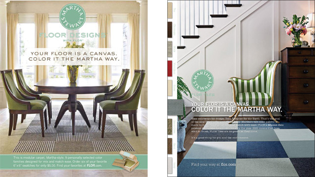
In the second campaign, we took FLOR's spirit of mix and match to heart. We brought all nine of Martha’s new colorways together in one ad, switching from single shoots to swatches to bring the colorways to life and visually define the product.

For the big screen, we developed a spot that displayed FLOR's diverse potential and spoke from the design sensibility and voice of Martha. The concept was a graphic treatment exploring the visual vocabulary and inspiration of the Martha collection through a kaleidoscope of floating squares: tile patterns on one side, room shots on the other.
All of this work helped FLOR build an ongoing, co-branding relationship with Martha Stewart. Perfect mix, perfect match.